If you ran a physical shop, you wouldn’t hire a salesperson who mumbles, hides the details, and disappears when asked about delivery or returns.
Online, that salesperson is your e-commerce store.
Your website, product pages, and checkout are doing the selling while you sleep, work, or refresh your ad dashboard like it owes you money.
What your store is supposed to do
A high-performing online store does three things, in this order:
- Directs: helps people understand where to go and what to do next
- Explains: answers key questions without making customers dig
- Reassures: removes fear around delivery, returns, payments, and quality
When this is done well, buying feels easy. When it isn’t, customers don’t “think about it.” They leave.
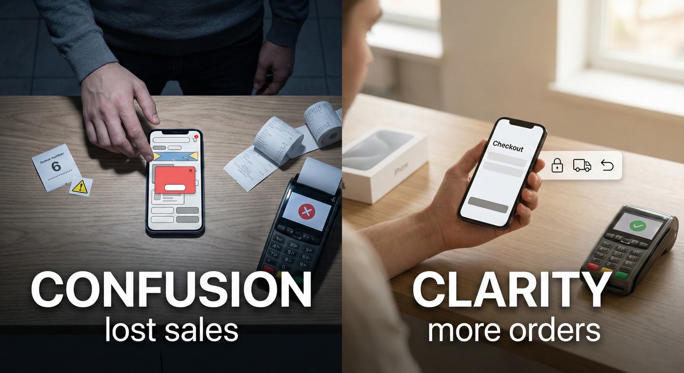
Why many stores don’t convert (even with good traffic)
Most conversion issues aren’t caused by lack of visitors. They’re caused by two silent killers:
- Confusion: “What is this, and is it for me?”
- Friction: “This is taking effort. I’ll do it later.” (They won’t.)
Confusion creates hesitation. Friction creates drop-offs.
And that’s how you end up with high cart abandonment and a founder blaming ads instead of the store experience.
The questions every customer asks (even if they don’t type them)
Customers don’t want a “brand journey.” They want answers:
What exactly am I buying and what do I get?
Why is it better than alternatives?
How long is delivery and what does shipping cost?
What if it doesn’t fit, doesn’t suit, or arrives damaged?
Can I trust checkout and payment?
Will this be annoying on mobile?
If your product page answers these clearly, you reduce doubt and improve conversion. If it doesn’t, customers hesitate. Online hesitation is just a quiet “no."
What high-performing e-commerce stores do differently
Good stores behave like a calm, competent salesperson.
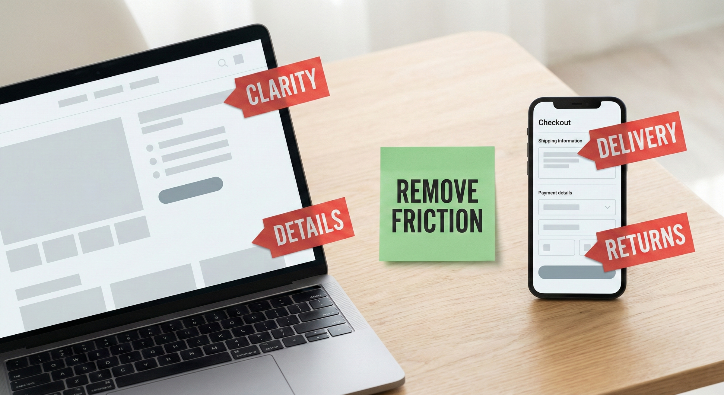
They lead with clarity, not clutter
One clear message and one obvious next step. Customers shouldn’t need to “explore” just to understand what you sell.
They make product pages do the heavy lifting.
Your product page isn’t a description. It’s a sales conversation:
benefits (in plain English)
what’s included
sizing/specs/materials (where relevant)
delivery ETA and returns policy visible before the decision
proof: reviews, UGC, guarantees, credibility cues
They reduce decision fatigue
Bestsellers, “most popular,” bundles, comparisons, recommendations. Choice is good until it becomes homework.
They make checkout boring (the highest compliment)
A smooth checkout improves conversion more than most people expect:
no surprise costs
no surprise delivery timelines
minimal steps
clear error messages
works flawlessly on mobile
The best checkout is forgettable. If customers remember it, that’s usually bad news.
Quick store health checklist (clarity + conversion)
Homepage / first screen
Clear headline: what you sell + who it’s for
3 short benefit bullets
One primary action (Shop bestsellers / Shop collection)
Product pages
Price + key benefit visible fast
Delivery ETA + returns visible before “Add to cart”
Key details: what’s included, sizing/specs, care/use, FAQs
Proof: reviews/UGC + simple trust cues near the buy button
Cart & checkout
Total cost and shipping shown early
Minimal distractions and steps
Payment feels secure and familiar
Mobile checkout feels effortless
The takeaway
Branding earns attention and trust.Your store experience turns that trust into sales.
If your e-commerce store feels clear, helpful, and low-friction, your conversion rate improves without needing louder ads or bigger budgets. Which is ideal, because nobody ever said, “I can’t wait to spend more on ads today.”